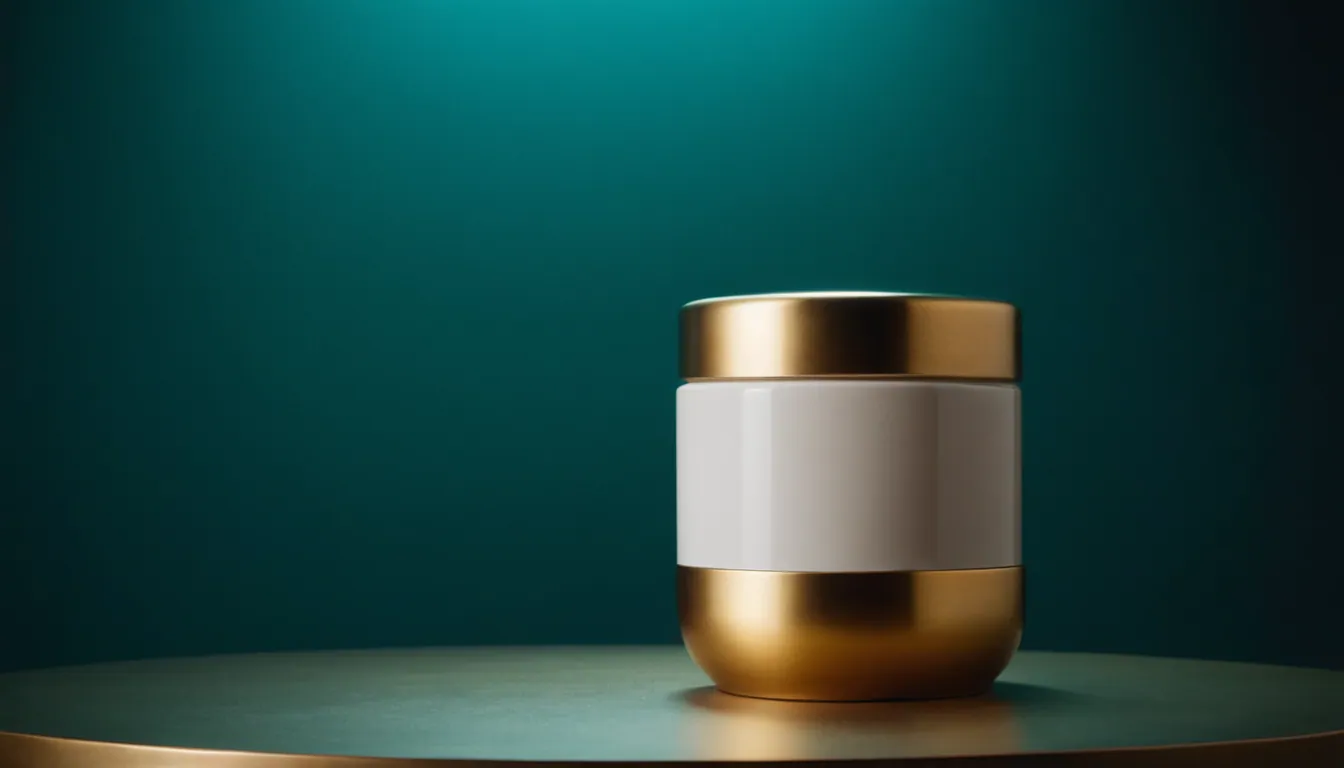
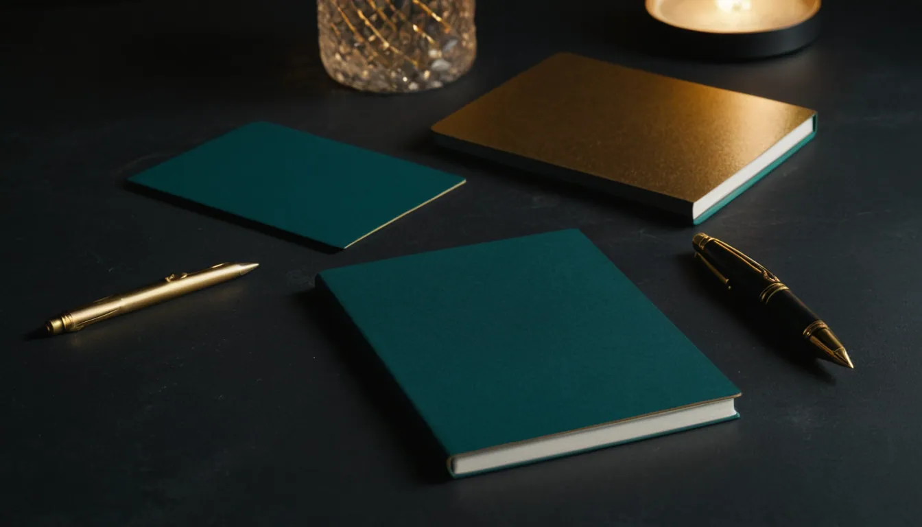
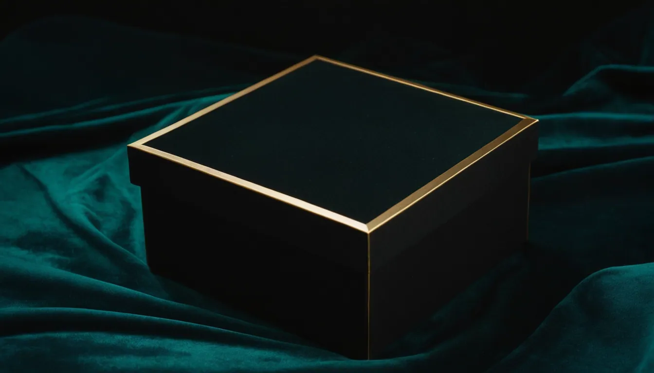
Art directing a product photoshoot means deciding, before the camera comes out, what the product should feel like and then controlling the surface, props, light and framing so every image says the same thing. The product itself must stay recognisable and accurate. Everything around it exists to support the brand, not compete with it.
Start with a visual brief, not a prop list
Props are the last decision, not the first. A one-page brief should answer:
- Who is looking? The buyer, where they will see the image and how large it will appear.
- What should it feel like? Three or four adjectives, for example calm, tactile, precise.
- What must be visible? The product features that justify the purchase.
- What is off limits? Colours, props or moods that contradict the brand.
Check the brief against your existing identity. If you already have colours, typography and image rules, the photography should obey them. Our guide to consistent visual identity across channels explains how to document these rules so photographers and designers can follow them.
The four decisions that shape the look
Surface
The surface is the stage. Its colour, texture and reflectivity change how the product reads.
| Surface | Effect | Watch out for |
|---|---|---|
| Matte paper or plaster | Soft, quiet, editorial | Marks and dust show easily |
| Timber | Warm, natural | Grain can overpower small products |
| Glass or acrylic | Clean, modern, reflective | Fingerprints, unwanted reflections |
| Stone or tile | Premium, grounded | Pattern may compete with the product |
| Seamless backdrop | Neutral, flexible | Can feel generic without other cues |
Pick a surface whose colour sits close to, but not identical with, the product. If the two merge, edges disappear.
Props
Props should answer a question the viewer has: how is it used, how big is it, what world does it belong to? A prop that answers none of these is decoration. A useful rule is to remove one prop from the set after you think it is finished. If the image still works, leave it out.
Keep scale honest. Props that imply the wrong size mislead buyers.
Light
Light creates form, texture and mood. Soft, large light sources suit most products because they give gentle gradients and softer shadows. Harder, directional light reveals texture and creates drama but can emphasise flaws. Decide the direction and softness once, then repeat it across the range so the images read as a family. Reflective products need controlled reflections, so plan the position of every light and card.
Colour and composition
Limit the palette to the product plus one or two supporting colours. Leave space around the product for cropping to different formats: square for feeds, portrait for stories, wide for web banners. Shoot the hero angle plus detail, scale and in-use frames so one shoot supplies many placements.
Keep the product true
Art direction must never change what the buyer will receive. The ACCC states that images of what is offered are treated like claims and must be accurate, and that the overall impression counts. Do not retouch colour, size, finish or texture beyond what the real product delivers.
Marketplaces add their own rules. Google Merchant Center asks for an unobstructed, clean view of the item, suggests framing the product to fill roughly 75 to 90 percent of the image, and places lifestyle scenes in a separate image field. It also asks that images made with generative AI keep their embedded metadata. If you plan to mix real photography with generated scenes, read our comparison of product photography and AI product imagery.
On-set checklist
- Product cleaned, steamed or polished, with spares on hand.
- Surface and backdrop checked for marks.
- Light direction and softness set and photographed as a reference frame.
- A colour card or grey card in a test frame to keep colour consistent.
- Hero, detail, scale and lifestyle frames all captured.
- Frames reviewed against the brief before the set is struck.
Common mistakes
- Choosing props before the brief.
- Mixing light directions across a range.
- Busy surfaces that fight the product.
- Shooting only one crop and discovering later that it will not fit a placement.
- Changing the look between shoots without updating the written rules.
A restrained set usually looks more expensive than a crowded one, a point we expand on in what makes a brand look premium.
Where Radiance Impact fits
Radiance Impact’s Studio covers AI commercials and product films, brand films, animation and post-production. To discuss a visual brief for your products, see Studio or contact us.
Sources
- False or misleading claims, Australian Competition and Consumer Commission
- Image link (image_link), Google Merchant Center Help